颜色
https://www.matplotlib.org.cn/gallery/color/colormap_reference.html
import numpy as np
import matplotlib as mpl
import matplotlib.pyplot as plt
from colorspacious import cspace_converter
颜色图通常根据其功能分为几个类别:
- 连续的:亮度变化和颜色的饱和度通常是递增的,通常使用单一色调;应该用于表示有顺序的信息。
- 发散:在中间以不饱和颜色相遇的两种不同颜色的亮度和可能饱和度的变化;当绘制的信息具有关键的中间值(例如地形)或数据偏离零附近时,应使用。
- 循环:两种不同颜色在中间相交并以不饱和颜色开始/结束的亮度变化;应该用于在端点处环绕的值,例如相位角、风向或一天中的时间。
- 定性:往往是杂色;应该用来表示没有顺序或关系的信息。
(https://matplotlib.org/stable/tutorials/colors/colormaps.html)(灰度转换)
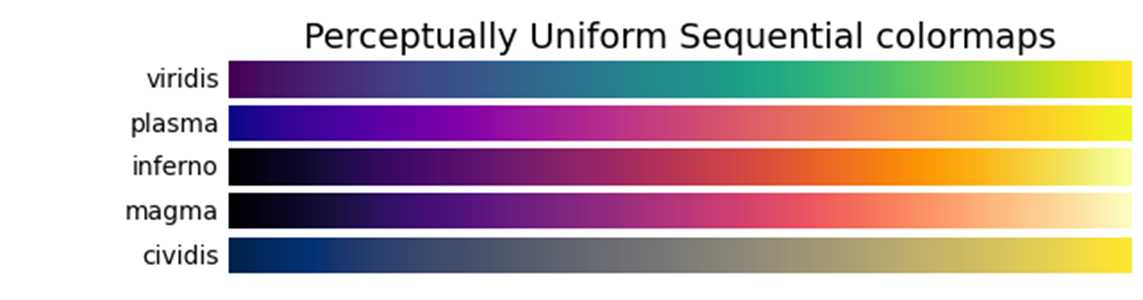
'viridis', 'plasma', 'inferno', 'magma', 'cividis'
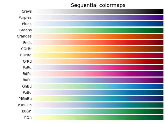
'Greys', 'Purples', 'Blues', 'Greens', 'Oranges', 'Reds',
'YlOrBr', 'YlOrRd', 'OrRd', 'PuRd', 'RdPu', 'BuPu',
'GnBu', 'PuBu', 'YlGnBu', 'PuBuGn', 'BuGn', 'YlGn'
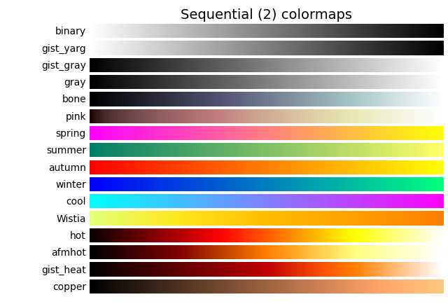
'binary', 'gist_yarg', 'gist_gray', 'gray', 'bone', 'pink',
'spring', 'summer', 'autumn', 'winter', 'cool', 'Wistia',
'hot', 'afmhot', 'gist_heat', 'copper'
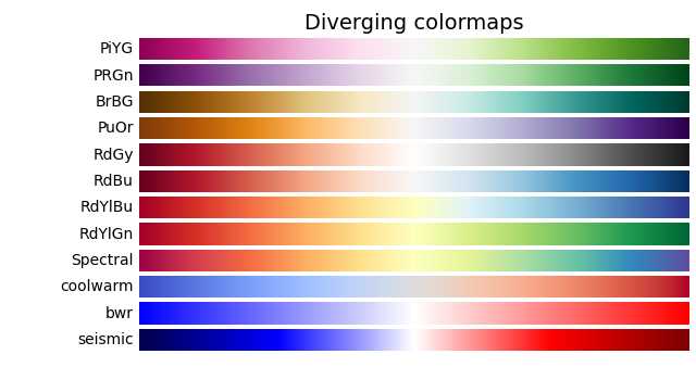
'PiYG', 'PRGn', 'BrBG', 'PuOr', 'RdGy', 'RdBu',
'RdYlBu', 'RdYlGn', 'Spectral', 'coolwarm', 'bwr', 'seismic'
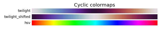
'twilight', 'twilight_shifted', 'hsv'
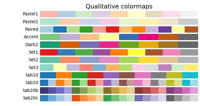
'Pastel1', 'Pastel2', 'Paired', 'Accent',
'Dark2', 'Set1', 'Set2', 'Set3',
'tab10', 'tab20', 'tab20b', 'tab20c'
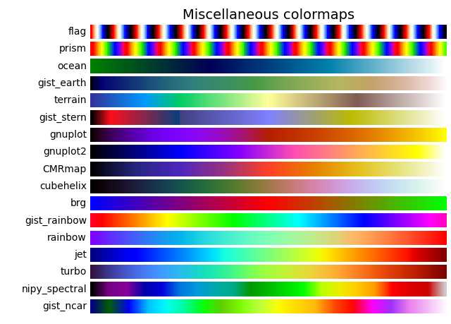
'flag', 'prism', 'ocean', 'gist_earth', 'terrain', 'gist_stern',
'gnuplot', 'gnuplot2', 'CMRmap', 'cubehelix', 'brg',
'gist_rainbow', 'rainbow', 'jet', 'nipy_spectral', 'gist_ncar'
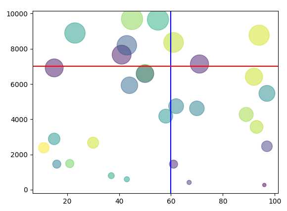
Matplotlib中的散点图、垂线和横线
设置散点的颜色、大小、透明度。
import matplotlib.pyplot as plt
import numpy as np

x = np.random.randint(10, 100, 30)

y = np.random.randint(100, 10000, 30)

colors = np.random.rand(30)

plt.scatter(x, y, c = colors, alpha = 0.5, s = y/10)
plt.axvline(60, color = 'b')
plt.axhline(7000, color = 'red')

plt.show()
效果如下图:
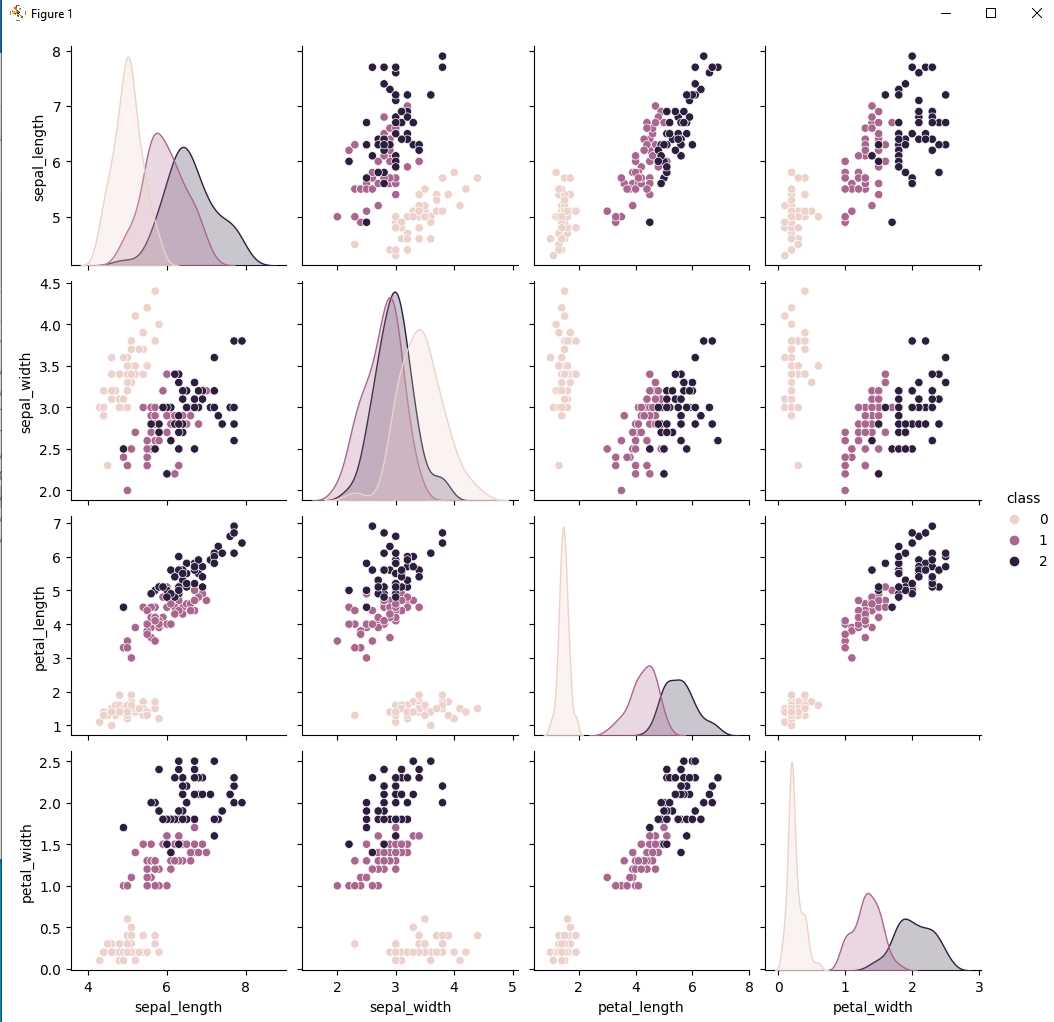
散点图矩阵 Scatterplot Matrix
# What, When & How of Scatterplot Matrix in Python
# https://vitalflux.com/what-when-how-scatterplot-matrix-pairplot-python/
# 三种纤维束数据对比

import pandas as pd
import numpy as np
import matplotlib.pyplot as plt
import seaborn as sns
from sklearn import datasets
#
# Load iris dataset
#
iris = datasets.load_iris()
#
# Create dataframe using IRIS dataset
#
df = pd.DataFrame(iris.data)
df.columns = ['sepal_length', 'sepal_width', 'petal_length', 'petal_width']
df['class'] = iris.target
#
# Create pairplot of all the variables with hue set to class
#
sns.pairplot(df, hue='class')
plt.show()
效果图如下:
Comments NOTHING